Error 404: Art Found — How Broken Web Pages Became a Designer's Canvas
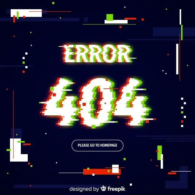
Photo: glitch art 404 error page digital design aesthetic, via img.freepik.com
There's a specific kind of dread that comes with a broken webpage. The spinning cursor that never resolves. The image that half-loads, pixelated and warped. The stark white screen interrupted by a three-digit error code. For most of us, it's a minor frustration — a blip in the otherwise seamless scroll of digital life. But for a growing cluster of designers and digital artists across the US and beyond, those moments of malfunction aren't just tolerable. They're the whole point.
Welcome to the accidental aesthetic — except nothing about it is actually accidental anymore.
The Error as Artifact
It started quietly, the way most underground movements do. Independent web designers — many working outside the gravitational pull of big tech agencies — began noticing something strange: the visual grammar of broken internet experiences was kind of beautiful. Not in a polished, intentional way. In the way that a scratched vinyl record or a water-damaged photograph is beautiful. Rough, honest, and weirdly human.
404 pages were an early obsession. Technically, they exist to tell you that a webpage is missing or moved. Functionally, most of them are dead ends — a corporate apology dressed in beige. But creatively? They're a blank canvas with zero expectations attached. Nobody's looking at a 404 page to be impressed. That absence of pressure turned out to be incredibly liberating.
Designers started leaning into the chaos. Illustrated monsters eating missing links. Glitchy text that looked like it was mid-corruption. Loading bars that deliberately stall out, mimicking the experience of dial-up internet in the late '90s. The joke was always that these were "broken" pages — but the designers building them knew exactly what they were doing.
Crafting Chaos, Pixel by Pixel
The technical side of this movement is more layered than it looks. Recreating the visual texture of a genuinely broken web experience requires an intimate understanding of how things actually break. You have to know what a JPEG looks like when its data is partially corrupted. You have to understand the specific color bleed of a failing CRT monitor, or the way an HTML page renders when its CSS file doesn't load.
Designers working in this space talk about it almost like method acting — you study the failure before you simulate it. Some pull reference images from archived "bad internet" archives. Others deliberately corrupt their own files and screenshot the results, then use those as texture overlays in more polished compositions. A few have built custom browser extensions that introduce controlled glitches into their own design workflows, just to capture something that feels genuinely unhinged.
The result is a design language that feels lived-in. Worn. Like it came from somewhere real rather than a mood board.
The Irony Economy
There's an obvious irony baked into all of this — and the designers doing it are completely aware of it. The internet spent decades trying to eliminate friction. Smoother interfaces, faster load times, fewer errors. The entire UX industry exists, at least in part, to make digital experiences feel invisible. And now a growing number of creatives are spending enormous amounts of time and skill meticulously recreating the friction that everyone else worked so hard to remove.
But that's kind of the whole joke, and also kind of the whole point. In a web landscape that's become increasingly homogenized — everything rounded corners, everything clean sans-serif, everything optimized for engagement metrics — the broken aesthetic reads as radical. It signals that whoever made this is not interested in playing the game the standard way.
For younger designers especially, there's something politically charged about it too. The sleek, seamless web is also the corporate web. The error-riddled, glitching, half-loaded web is the weird web — the one that existed before venture capital colonized every corner of the internet. Embracing the aesthetic of failure is, in some small way, a rejection of the optimization-above-all ideology that shaped the modern internet.
Loading Screens and Liminal Spaces
Beyond 404 pages, the movement has expanded into other overlooked corners of the digital experience. Loading screens — those interstitial moments between content — have become a particular obsession. Artists are designing loading animations that never quite resolve, keeping viewers suspended in a state of anticipation that starts to feel meditative rather than frustrating.
There's a whole genre of digital art now that lives in that liminal zone. Video installations that mimic the visual noise of a corrupted video stream. Websites deliberately built to load incorrectly, serving up scrambled text and misaligned images as the intended experience. Interactive pieces where "clicking through" errors is the actual narrative.
Galleries — both physical and virtual — are starting to take notice. Several digital art festivals in cities like New York, Los Angeles, and Chicago have featured work explicitly rooted in broken-web aesthetics over the past couple of years. What was once a niche design subculture is edging toward something that gets taken seriously in capital-A Art spaces.
Why Now?
The timing isn't random. As AI-generated imagery floods the internet with technically perfect, eerily smooth visuals, the handmade roughness of glitch aesthetics carries a different kind of cultural weight. An image that looks broken — that shows its seams — is an image that couldn't have been generated by a machine chasing perfection. There's an authenticity signal embedded in imperfection that's becoming more valuable as flawless AI content becomes more ubiquitous.
There's also nostalgia at play, though it's a strange kind. Millennials who grew up with dial-up internet and regular browser crashes have a complicated affection for those early digital textures. For Gen Z designers who came of age on a much smoother web, the broken aesthetic is more like archaeology — an excavation of an internet they never quite experienced, filtered through a contemporary creative lens.
The Signal in the Noise
What makes this movement genuinely interesting isn't just the visual output — it's the philosophical stance underneath it. These designers are arguing, through their work, that beauty doesn't require functionality. That the places where systems fail are just as worthy of aesthetic attention as the places where they succeed. That the void — the empty, broken, unreachable page — has something to say.
The 404 error was always a message. It just took a while for the right people to start reading it.
And now that they have, the broken web has never looked better.