Ugly Is the New Interesting: The Designers Torching Silicon Valley's Aesthetic Rulebook
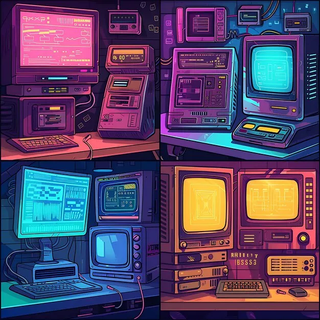
Photo: maximalist colorful retro web design computer screen neon chaos, via img.freepik.com
Let me describe two websites to you.
The first has a white background, a sans-serif font that's probably Inter or its cousin, generous whitespace, a muted color palette of maybe two or three tones, and a hero image that's either a gradient or a photograph of someone looking thoughtfully at a laptop. Navigation is minimal. Everything breathes. It's fine.
The second has a background that's somewhere between chartreuse and radioactive, three different fonts competing for dominance, a navigation menu that appears to have been designed by someone who genuinely hates you, animated GIFs that weren't ironic in 2003 and aren't ironic now, and a layout that makes you feel like you opened the wrong door at a party. You cannot stop looking at it.
One of these websites you will forget in four minutes. The other you will tell someone about tomorrow.
The Tyranny of Clean
Somewhere in the mid-2010s, an aesthetic consensus quietly took over the tech industry and then radiated outward to consume everything adjacent to it. Call it the Apple effect, the Airbnb effect, the "good design is invisible" doctrine — whatever the label, the result was a world of interfaces, apps, and websites that all began to feel like they were designed by the same extremely tasteful ghost.
Minimalism became the default language of credibility. If your product looked clean, it looked serious. If it looked serious, investors trusted it, users trusted it, the whole machine trusted it. Visual noise became a signal of amateurism. Clutter meant you didn't know what you were doing.
This wasn't entirely wrong. There are real usability principles underneath the minimalist doctrine. But somewhere along the way, the principle calcified into a kind of aesthetic authoritarianism — and a growing cohort of designers, artists, and developers started pushing back hard.
The Reaction Has a Name (Sort Of)
The movement doesn't have one clean label, which is fitting. You'll hear it called maximalism, brutalism (in the web design sense), anti-design, or just "weird internet." What ties it together is a shared rejection of the idea that polish equals quality, and a deliberate embrace of visual elements that the tech industry's taste machine would flag as errors.
Think of sites like Craigslist, which has barely changed its layout since the early 2000s and has become almost iconic for it. Or the deliberate ugliness of certain indie game UIs — games like Hypnospace Outlaw or Doki Doki Literature Club that weaponize garish early-internet aesthetics to create genuine emotional discomfort. Or the wave of artists on platforms like Are.na and Cargo who are building sites that look like they were assembled from the wreckage of a 1998 GeoCities page, but with complete intentionality.
This isn't nostalgia, though nostalgia is in the mix. It's something more pointed: a philosophical argument about what design is actually for.
What "Ugly" Actually Communicates
Here's the uncomfortable truth that the minimalism doctrine doesn't want to acknowledge: visual friction creates memory.
When something looks exactly like everything else, your brain files it and moves on. The smoothly designed app, the clean landing page, the tasteful portfolio — they register as correct and then disappear from conscious attention. They do their job and become invisible, which is apparently the goal, but invisible things don't build culture. Invisible things don't get talked about.
The stuff that gets talked about is the stuff that catches. And catching requires friction.
This is why Liminal Spaces content went viral — those images of empty, slightly wrong-looking institutional spaces hit something that a beautifully composed landscape photograph doesn't. It's why the most memorable video game environments are often the ones that feel somehow off. It's why your brain still holds onto the exact layout of that one weird website you stumbled onto in 2011.
Ugly design, done intentionally, is actually a form of honesty. It says: we're not trying to disappear. We're not trying to be invisible infrastructure. We made choices, weird ones, and we're standing behind them.
The Indie Game Designers Leading the Charge
If you want to see this philosophy operating at its most sophisticated, look at the indie game development scene. Developers like Toby Fox (Undertale), Thecatamites, and the team behind Disco Elysium have all used visual roughness as an expressive tool — not because they lacked the budget for polish, but because polish would have undermined the emotional register they were reaching for.
Disco Elysium's UI is dense, text-heavy, and demands attention in a way that a streamlined interface never would. That friction is part of how the game communicates that the world it's depicting is complicated, layered, and resistant to easy navigation. The design is the argument.
Meanwhile, web designers like Olia Lialina have spent decades making the case for a vernacular internet aesthetic — the kind of visual language that emerged organically from millions of non-designers making things they thought looked cool in the late '90s — as a legitimate and valuable form of expression. Her essay "A Vernacular Web" is required reading if you want to understand why the homogenization of internet aesthetics is actually a cultural loss.
Silicon Valley Taste Is Not Universal Taste
There's a political dimension here that's worth naming directly.
The minimalist aesthetic consensus wasn't just an aesthetic development — it was a class and cultural statement. It reflected the tastes of a specific demographic in a specific geographic bubble, and it got exported globally as if it were objective truth about what good design looks like. The implicit message was: if your design doesn't look like this, you're not sophisticated. You're not serious. You're not part of the conversation.
The deliberate embrace of ugliness is, among other things, a rejection of that hierarchy. It says that the aesthetic instincts of a teenager making a Neocities page for their favorite band are just as valid as the instincts of a UX team at a Series B startup. It reclaims visual weirdness as a form of self-expression rather than a failure to achieve correctness.
This is why the trend feels particularly alive in communities that have historically been pushed to the margins of tech culture — queer digital artists, indie game devs, zine makers, the whole ecosystem of people who were never going to get a designer's approval anyway and decided to make something interesting instead.
The Signal in the Noise
Voidcast's whole premise is that the interesting stuff happens where the signal breaks. Clean design is an optimized signal — it transmits efficiently and loses itself in the transmission. Ugly design is what happens when the noise gets in, when the human fingerprints show up in the data, when the medium stops pretending to be neutral.
The designers torching Silicon Valley's rulebook aren't making things that are hard to use for the sake of it. The best of them are making things that are genuinely harder to forget — interfaces and layouts that carry a point of view, that take up space, that refuse to be invisible infrastructure.
In a digital landscape where every app looks like every other app and every website looks like a slightly different arrangement of the same ten components, that refusal is starting to feel like the most interesting design choice available.
Make it ugly. Make it memorable. Make it yours.